
You spend time and money driving targeted traffic to your website. Your ad campaigns are optimized, your copy is sharp, and your service offerings are top-tier. But when you check your analytics, the numbers tell a frustrating story: traffic is coming in, but conversions are lagging.
When a digital sales funnel underperforms, business owners often assume there’s an issue with their offer or pricing. In reality, the culprit is often bad User Interface (UI) and User Experience (UX) design.
UI is how your website looks; UX is how your website feels and functions as a user navigates it. When design choices create friction, confuse visitors, or hide clear next steps, visitors leave.
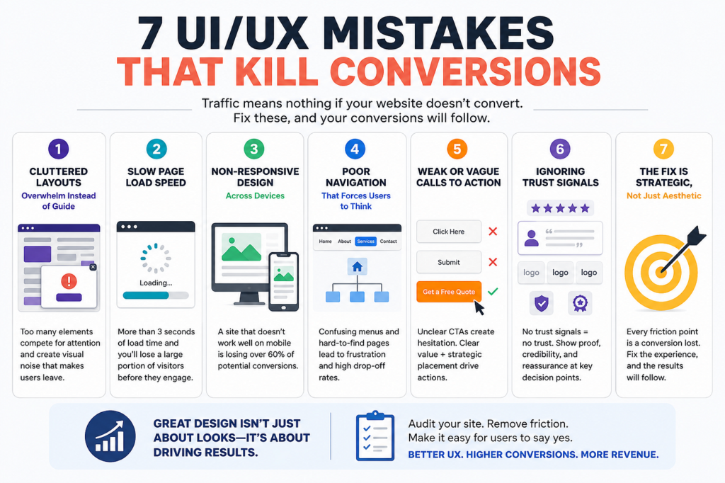
Here are seven common UI/UX design mistakes that kill online sales funnels, along with actionable fixes to convert more visitors into paying clients.
1. Visual Clutter and Lack of Focal Hierarchy
When every element on a web page competes for attention, nothing stands out. Websites packed with multiple banner styles, competing pop-ups, dense text blocks, and chaotic color schemes overwhelm visitors immediately.
       POOR HIERARCHY (VISUAL CLUTTER)            CLEAR HIERARCHY (HIGH-CONVERSION)
  +-------------------------------------+      +-------------------------------------+
  | [BANNER] [SALE] [POPUP] [TEXT...]   |      |  CLEAR HERO HEADLINE (H1)           |
  | [NAV] [IMAGE] [FORM] [BUTTON 1]     |      |  Subheadline explaining value proposition |
  | [TEXT...] [BUTTON 2] [SIDEBAR...]   |      |  [ PRIMARY CALL-TO-ACTION BUTTON ]  |
  +-------------------------------------+      +-------------------------------------+
                    |                                             |
                    v                                             v
       [ User Friction & Confusion ]                [ Guided Focus & High Conversion ]
The Friction Point
Human brains process visual information in predictable scanning patterns (like the Z-pattern or F-pattern). If a page lacks a clear visual hierarchy, visitors don’t know where to look or what action to take first, creating cognitive overload.
The Fix
- Use Intentional White Space: Give text, images, and buttons room to breathe. White space guides the eye toward critical information.
- Establish Typographic Hierarchy: Use clear font sizes—a prominent H1 headline, distinct H2 section titles, and scannable body text.
- One Primary Action Per Section: Every section of your landing page should guide the user toward a single primary call-to-action (CTA).
2. Weak, Confusing, or Competing Calls-to-Action (CTAs)
A common funnel mistake is overwhelming users with too many options on a single page. If your homepage simultaneously asks visitors to “Schedule a Call,” “Download an Ebook,” “Browse Services,” and “Subscribe to the Newsletter,” you’re creating decision paralysis.
+----------------------------------------------------------------------------------+
|                            THE CTA DECISION MATRIX                               |
+----------------------------------------------------------------------------------+
|                                                                                  |
|   BAD PRACTICE: Competing Actions                                                 |
|   [ Book Call ]  [ Download PDF ]  [ View Pricing ]  [ Join Newsletter ]         |
|   Result: Decision paralysis ===> User leaves without taking action.            |
|                                                                                  |
|   GOOD PRACTICE: Focused Primary Action + Supporting Secondary Action            |
|   [ BOOK A STRATEGY CALL ] (Primary High-Contrast Button)                        |
|   [ View Service Overview ] (Secondary Subtle Outline Link)                       |
|   Result: Clear direction ===> Higher overall conversion rates.                   |
|                                                                                  |
+----------------------------------------------------------------------------------+
The Friction Point
When presented with too many options, users often choose nothing at all. Generic CTA button text like “Submit” or “Click Here” also fails to communicate value, lowering click-through rates.
The Fix
- Focus on One Primary Goal: Define the main objective of each page and make that CTA visually dominant.
- Use Action-Oriented Text: Replace vague labels with specific benefits, like “Get Your Custom Web Quote” or “Schedule Your Free Audit.”
- Style High-Contrast Buttons: Ensure your primary CTA button stands out visually from the rest of the page layout.
3. Desktop-First Design That Breaks on Mobile Devices
Mobile devices drive over half of all global web traffic. Yet many websites are still designed for wide desktop screens first, then awkwardly shrunk down to fit mobile viewports.
+---------------------------------------------------------------------------------+
|                        MOBILE UX CHECKLIST vs. DESKTOP ERGONOMICS              |
+---------------------------------------------------------------------------------+
|                                                                                 |
|  [Desktop Viewport]                        [Mobile Viewport - Thumb Zone]       |
|  +-----------------------+                 +-----------------------+            |
|  | Nav Links | Contact   |                 | [ Header / Brand ]    |            |
|  |                       |                 |                       |            |
|  | Main Hero Copy        |                 | Main Hero Copy        |            |
|  |                       |                 |                       |            |
|  | [ Clickable CTA ]     |                 | [ EASY-TOUCH CTA ]    | <== Natural|
|  +-----------------------+                 +-----------------------+     Reach  |
|                                                                                 |
+---------------------------------------------------------------------------------+
The Friction Point
Mobile UX issues ruin conversions quickly:
- Tiny text that requires pinch-zooming to read.
- Buttons placed too close together, causing accidental taps.
- Complex navigation menus that fill the whole screen.
- Heavy desktop images that load slowly over mobile connections.
The Fix
- Design Mobile-First: Map out layout structures, touch targets, and content flows for handheld viewports before scaling up to desktop screens.
- Optimize Touch Targets: Ensure all buttons and interactive links are at least 48×48 pixels so users can tap them easily.
- Keep Contact Info Accessible: Use sticky navigation headers or fixed bottom action bars so mobile users can reach key pages or contact forms instantly.
4. Complex Form Fields with High Effort
Your contact or checkout form is the final hurdle in your sales funnel. Every unnecessary field you include creates friction and increases drop-off rates.
       HIGH-FRICTION FORM                          LOW-FRICTION FORM
  +----------------------------------+        +----------------------------------+
  | Full Name                        |        | Full Name                        |
  | Company Name                     |        | Work Email                       |
  | Phone Number                     |        | How can we help?                 |
  | Street Address                   |        +----------------------------------+
  | Annual Revenue                   |        | [ SUBMIT INQUIRY ]               |
  | How did you hear about us?       |        +----------------------------------+
  | Detailed Project Scope           |          (Saves time, captures lead fast)
  +----------------------------------+
    (High abandonment rate)
The Friction Point
Asking for personal phone numbers, physical addresses, or detailed company data on an initial inquiry form scares off leads who aren’t ready to share that much information yet.
The Fix
- Cut Down Form Fields: Ask only for essential details on initial lead forms (e.g., Name, Email, and Brief Message). You can gather deeper details later.
- Use Multi-Step Forms for Complex Processes: If you need detailed information for an estimate, split the form into dynamic multi-step stages showing a clear progress bar.
- Enable Auto-Fill and Input Validation: Use inline validation to highlight errors in real time, rather than resetting the form after submission.
5. Slow Visual Feedback and Lack of Micro-Interactions
When visitors interact with your site—clicking a button, submitting a form, or adding an item to a cart—they expect immediate visual feedback. If a page hangs or doesn’t acknowledge an action, users assume the site is broken and click away or hit submit multiple times.
+----------------------------------------------------------------------------------+
|                           MICRO-INTERACTION UX FLOW                              |
+----------------------------------------------------------------------------------+
|                                                                                  |
|   1. USER ACTION        ===>  User clicks "Submit Quote Request"                 |
|   2. INSTANT FEEDBACK   ===>  Button changes state to "Processing..." + Loader   |
|   3. SUCCESS CONFIRM    ===>  Inline success badge: "Request Received!"          |
|                                                                                  |
|   Result: Prevents page abandonment, duplicate form entries, and user frustration.|
|                                                                                  |
+----------------------------------------------------------------------------------+
The Friction Point
A lack of micro-interactions makes your web application feel uninspired or sluggish. If a form button doesn’t show a processing state when clicked, users often re-click or leave, resulting in duplicate entries or lost sales.
The Fix
- Add Clear Hover and Active States: Ensure buttons, links, and form fields change color or elevation when hovered over or clicked.
- Use Processing Loaders: Display immediate inline loading animations on forms and checkout buttons upon submission.
- Provide Instant Success Messages: Show confirmation notices right on the page without forcing unnecessary redirects.
6. Hiding Pricing and Service Details Behind Friction
Potential clients want clear answers about what you do, how you work, and roughly what it costs. When websites lock essential service breakdowns or starting price ranges behind mandatory sales calls or lengthy forms, users often leave to find a competitor who is more transparent.
+---------------------------------------------------------------------------------+
|                       TRANSPARENT UX vs. HIGH-FRICTION UX                       |
+---------------------------------------------------------------------------------+
|                                                                                 |
|  [ HIGH-FRICTION UX ]                                                           |
|  "Custom solutions available. Fill out a 10-field form to request a call."      |
|  ===> Outcome: High bounce rate; users seek immediate answers elsewhere.        |
|                                                                                 |
|  [ TRANSPARENT UX ]                                                             |
|  "Web Development Packages starting from $X. Clear scope, timeline, and deliverables."|
|  ===> Outcome: Builds immediate trust; qualifies high-intent leads upfront.     |
|                                                                                 |
+---------------------------------------------------------------------------------+
The Friction Point
Hiding essential details forces users to jump through extra hoops just to see if your services fit their budget or scope, adding unnecessary delay to the buying process.
The Fix
- Publish Clear Starting Prices or Packages: Even for fully custom work, providing baseline tiers or estimated starting ranges helps qualify prospective leads.
- Detail Your Service Process: Outline clear, step-by-step breakdowns showing what happens after a client hires your team.
- Include an FAQ Section: Address common objections, timelines, and technical requirements right on the service page using expandable accordions.
7. Generic Aesthetics and Missing Trust Signals
In digital business, visual design directly drives credibility. If your site looks like an untouched default template, features generic stock photos, or lacks social proof, visitors will doubt your expertise.
+----------------------------------------------------------------------------------+
|                            THE TRUST BUILDING FRAMEWORK                          |
+----------------------------------------------------------------------------------+
|                                                                                  |
|   1. REAL CASE STUDIES     ===>  Show actual client results and live screenshots |
|   2. VERIFIED REVIEWS      ===>  Embed real client testimonials with photos      |
|   3. SECURITY BADGES       ===>  Display SSL encryption certificates & payment icons|
|   4. TRANSPARENT TEAM      ===>  Include real team photos and agency credentials  |
|                                                                                  |
+----------------------------------------------------------------------------------+
The Friction Point
Generic stock photography of corporate handshakes or unnatural model smiles erodes trust. Without clear social proof, prospective clients lack the confidence to take action.
The Fix
- Display Social Proof Near Action Points: Place real client testimonials, star ratings, and review snippets right next to your primary CTA buttons or forms.
- Showcase Real Work: Replace generic stock visuals with actual screenshots, project walk-throughs, and detailed case studies showing real-world results.
- Highlight Trust Badges: Display SSL security markers, verified client logos, and official industry certifications across your footer and checkout pages.
Evaluating UI/UX Impact on Conversion Rates
The table below breaks down how fixing these UI/UX design mistakes directly improves user engagement and conversion metrics across your sales funnel:
| UI/UX Design Problem | Direct Impact on Funnel | Strategic UI/UX Solution | Primary Metric Improved |
| Visual Clutter | High bounce rate due to cognitive overload. | Implement white space, clear font sizes, and structured layouts. | Reduced Bounce Rate |
| Competing CTAs | Decision paralysis; visitors leave without acting. | Focus on one primary call-to-action button per section. | Increased Click-Through Rate |
| Mobile Friction | High drop-off rates on mobile screens. | Build mobile-first layouts with comfortable touch targets. | Improved Mobile Conversions |
| Long Lead Forms | Form abandonment on the final step. | Shorten forms to essential fields and use multi-step layouts. | Higher Form Completion Rate |
| Hidden Information | Users leave to check transparent competitors. | Publish clear service scopes, FAQs, and price ranges. | Higher Qualified Lead Quality |
Converting Traffic into Revenue with Strategic Design
A well-designed website isn’t just about looking clean—it’s about removing friction and guiding visitors toward becoming paying clients.
At CrystalJenix Technologies, we design and build custom web experiences tailored specifically around your business conversion goals. By pairing modern UI layout principles with high-performance UX, we ensure your sales funnel turns traffic into revenue.
Instead of losing leads to confusing navigation, complex forms, or clunky layouts, investing in custom UI/UX design helps you convert more visitors and scale your business efficiently.
Quick UI/UX Audit Checklist for Your Sales Funnel
Run your landing pages through these questions to identify conversion friction:
- [ ] Visual Clarity Test: Can a new visitor figure out what your business does and what action to take within 5 seconds of landing on your page?
- [ ] Mobile Ergonomics Check: Are all buttons, form fields, and navigation links easy to tap on a mobile device without zooming in?
- [ ] Form Friction Audit: Does your main contact form ask for only essential fields needed to start a conversation?
- [ ] Social Proof Placement: Is verified social proof (testimonials, client logos, case studies) displayed near your primary CTA buttons?
- [ ] CTA Contrast Verification: Does your main action button stand out visually from the rest of the page layout?
Is your website losing leads? Let’s audit your funnel’s UI/UX and design a high-converting web presence for your business today.